Enhanced App Store Screenshot Strategy
1. TACTICAL OBJECTIVE: Ignite Curiosity & Drive Immediate Downloads
Your primary conversion goal is to compel App Store browsers to instantly download your AI art app. The target audience is captivated by visual innovation and creative potential, but bombarded with app choices. Their psychology is driven by:
Visual Awe: They seek striking, inspiring visuals that showcase AI's capabilities.
Instant Gratification: They want to see immediate creative possibilities and effortless generation.
Curiosity & Trend Following: They are drawn to novelty and being part of the AI art trend.
Simplicity & Accessibility: They need to perceive the app as user-friendly, not complex or intimidating.
Your screenshots must bypass passive interest and trigger an irresistible urge to explore. Amateur visuals signal low value and get scrolled past. Professional, psychologically-crafted visuals scream "must-have tool" and drive downloads.
2. VISUAL HIERARCHY BLUEPRINT: The Curiosity Cascade
Instead of feature lists, architect a visual story that unfolds across screenshots, building curiosity and desire. Each screenshot serves as a deliberate focal point, leading the eye and mind towards the download button.
Screenshot 1 (Hero - The "Wow" Moment):
Dominant Focal Point: Spectacular, hyper-realistic AI artwork generated by your app. Choose an image that exemplifies the highest visual potential. This is your hook – pure visual impact.
Secondary Element (Subtle Text): Overlay a minimalist, intriguing tagline like "Unleash AI Artistry" or "Imagine. Generate. Amaze." Text is secondary to the visual; less is MORE here.
Screenshot 2 (Model Power - The "Brain"):
Focal Point: Visually represent the breadth of AI models. Instead of just text, use stylized icons or logos of key LLMs (ChatGPT, Deepseek, etc.) arranged dynamically. Think a constellation or network effect.
Secondary Element (Concise Benefit): Beneath the icons, add short, powerful text: "Powered by the Best AI." Emphasize the underlying tech strength without technical jargon.
Screenshot 3 (Image Magic - The "Output"):
Focal Point: Showcase a diverse range of AI art styles. A visually compelling grid or carousel displaying different artistic outputs – photorealistic portraits, abstract landscapes, fantasy scenes, etc.
Secondary Element (Action-Oriented Text): "Your Vision, Instantly Visualized." or "Generate Anything You Imagine." Focus on user empowerment and ease of creation.
Screenshot 4 (Prompt Power - The "Tool"):
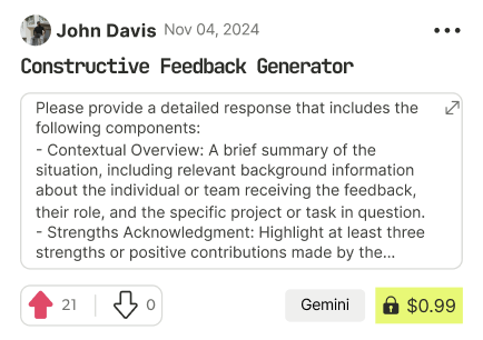
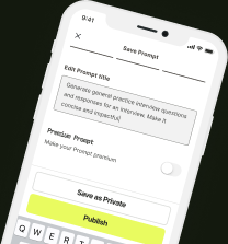
Focal Point: Visually depict the prompt interface. Use a clean, mockup screenshot of the app UI, highlighting the ease of prompt entry and browsing. Show example prompts that are intriguing but simple.
Secondary Element (Benefit-Driven Text): "Unlock Pro-Level Prompts." or "Prompts That Inspire & Deliver." Emphasize access to quality prompts, not just quantity.
Screenshot 5 (Efficiency & Results - The "Value"):
Focal Point: Visual metaphor for speed and efficiency. This could be a stylized stopwatch graphic integrated with an impressive AI artwork, or a before-and-after comparison showcasing quick prompt-to-image results.
Secondary Element (Direct Benefit): "Seconds to Stunning AI Art." or "Fast Prompts, Incredible Results." Highlight time savings and immediate impact.
Screenshot 6 (Community & Portfolio - The "Ecosystem"):
Focal Point: Visual mockup of a user profile or portfolio display. Showcase attractive user-generated AI art, likes/views, and the potential for sharing and recognition. Suggest a vibrant community.
Secondary Element (Inspirational Text): "Become an AI Art Creator." or "Share Your Vision, Build Your Portfolio." Focus on community and personal growth.
3. PSYCHOLOGICAL DESIGN ARSENAL: Color, Typography, Composition
Color Psychology:
Dominant Background: Deep, saturated dark blue (12182B) or charcoal gray (333333). Dark backgrounds create a sense of sophistication, modernity, and make vibrant visuals pop. Avoid light or pastel backgrounds, which appear generic and less impactful in the App Store.
Accent Colors: Electric cyan (00FFFF), vibrant magenta (FF00FF), and energetic orange (FF9900). Use these sparingly but strategically for text highlights, UI elements, and to draw attention to key features. These colors convey innovation, creativity, and excitement associated with AI and futuristic tech.
Avoid: Overuse of bright, clashing colors. Keep the color palette controlled and purposeful. Avoid muddy or muted tones that lack visual impact.
Typography Combinations:
Headline Font (Hero & Key Benefits): A bold, modern sans-serif like "Bebas Neue" or "Montserrat Bold". These fonts are clean, impactful, and convey confidence. Use all caps for maximum visual weight.
Body/Subtext Font (Concise Descriptions): A slightly lighter weight sans-serif from the same family or a complementary font like "Open Sans" or "Lato Regular". Ensure readability at smaller sizes. Use sentence case for better scannability in subtext.
Contrast is Key: Maximize contrast between text color and background. White or very light gray text on dark backgrounds is highly effective. Avoid low-contrast color combinations.
Layout Structures:
Rule of Thirds: Position focal points at the intersections of the rule of thirds grid to create dynamic and visually balanced compositions.
Whitespace as a Weapon: Don't overcrowd screenshots. Generous whitespace around visuals and text creates a sense of sophistication and allows elements to breathe. Whitespace directs focus.
Asymmetrical Balance: Consider asymmetrical layouts for a more modern and dynamic feel. This creates visual tension and guides the eye naturally. Avoid perfectly symmetrical, predictable layouts.
4. PRECISE ELEMENT GUIDANCE: Tension, Eye Movement, Dominance
Creating Tension:
Contrast in Imagery: Juxtapose hyper-realistic AI art with minimalist text or UI elements. This contrast amplifies the impact of both.
Scale Variation: Use dramatic scale differences. Giant AI artwork dominating the frame, with small, concise text in corners or edges.
Color Contrast: Vibrant accent colors against the dark background create visual sparks and tension.
Directing Eye Movement:
Leading Lines: If applicable, use lines within the AI art itself or graphic elements (subtle arrows, angled shapes) to guide the eye towards text or UI elements.
Focal Point Dominance: Ensure the primary visual (AI artwork) is undeniably the most prominent element. Everything else should support and direct attention towards it.
Z-Pattern Layout (Implied): While not strictly a Z-pattern, arrange elements to encourage a natural left-to-right, top-to-bottom reading flow across the screenshots, leading towards the ultimate call to action (download).
Establishing Visual Dominance:
Visual Hierarchy by Size: AI artwork is largest, headlines are secondary in size but bold, subtext is smallest and most concise.
Color Dominance: Vibrant accent colors are used strategically to highlight key text and elements, but the dominant color is the dark, sophisticated background, making the AI art itself the visual star.
Whitespace Dominance: Use whitespace to isolate and emphasize the key visual and text elements, preventing visual clutter and reinforcing dominance.
5. IMPLEMENTATION INSTRUCTIONS: Strategic Execution
1. Source High-Impact AI Art: Curate your absolute best, most visually stunning AI-generated examples. These are your visual weapons. Ensure variety in style across screenshots to showcase app versatility.
2. Design in Layers (Photoshop, Figma, etc.): Use professional design software. Design each screenshot as separate layered files for easy editing and adjustments.
3. Dark Background Foundation: Start with the chosen dark background color as the base layer for each screenshot.
4. Integrate AI Art Dominantly: Place the selected AI artwork as the primary visual layer, ensuring it commands attention and fills a significant portion of the screen space.
5. Craft Concise, Psychological Text: Write short, benefit-driven headlines and subtext based on the outlined hierarchy. Use the prescribed typography and color palette.
6. Incorporate UI Mockups (Strategically): Where relevant (screenshots 4 & 6), integrate clean, minimal UI mockups of your app interface, showcasing ease of use and key features visually.
7. Whitespace Management: Intentionally add whitespace to frame visuals and text, creating a clean and professional aesthetic. Avoid filling every pixel.
8. Test and Iterate (Critical): Upload draft screenshots to the App Store Connect (or similar) preview and view them on actual devices. Assess visual impact, readability, and overall flow. Get feedback and iterate based on what works best. A/B test different visual approaches if possible.
9. Optimize for App Store Preview Size: Ensure text remains legible and visuals are impactful even when screenshots are scaled down in the App Store browsing view.
By implementing these tactical design directives, you will transform your App Store screenshots from passive descriptions into active psychological triggers, compelling viewers to download and experience the power of your AI art app. Remember, in the digital battlefield of the App Store, generic visuals are invisible. Strategically designed visuals are weapons of conversion.

Find Powerful AI Prompts
Discover, create, and customize prompts with different models, from ChatGPT to Gemini in seconds

Simple Yet Powerful
Start with an idea and use expert prompts to bring your vision to life!
